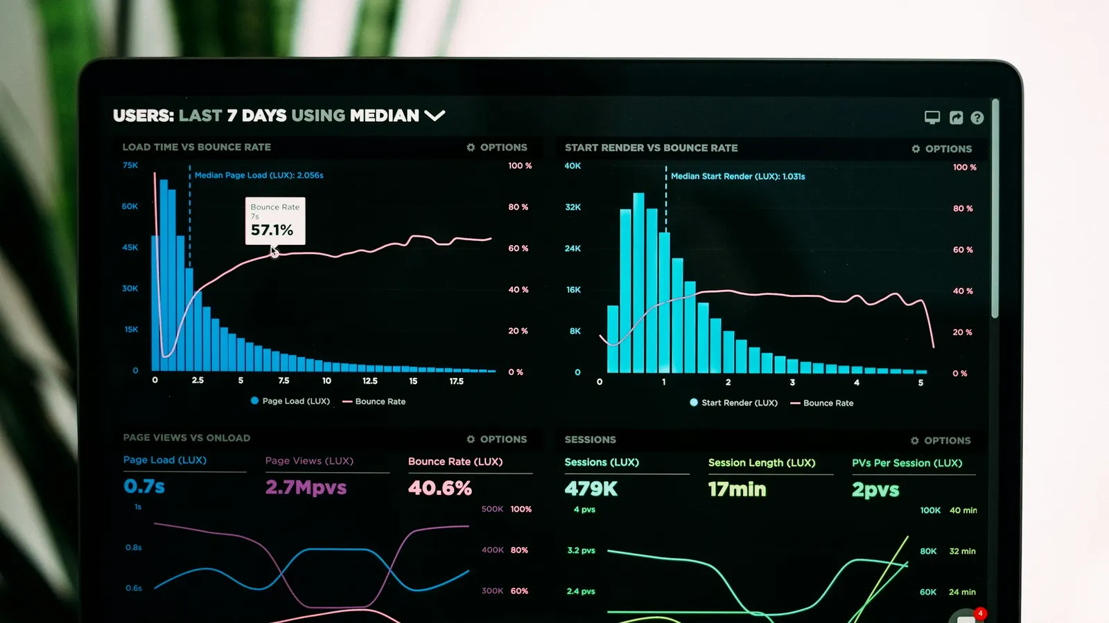
Custom business dashboard development for CEOs and COOs — choosing real metrics over vanity numbers, refresh strategy, and mobile access.
Custom Business Dashboard Development
Direct answer: Custom business dashboard development means building a system that pulls data from the tools a business already runs — CRM, finance, operations, product analytics — into one view that answers the specific questions leadership actually asks, rather than displaying every metric those systems happen to expose. The decisions that determine whether a dashboard gets used past the first month are picking the right metrics over vanity numbers, choosing real-time versus scheduled refresh deliberately per data source, and designing for mobile access if leadership needs to check numbers away from a desk. A focused single-domain dashboard fits the $2,000 Growth tier; a multi-source executive dashboard with real-time feeds is typically a $4,000+ Enterprise build scoped after discovery.
CEOs and COOs commissioning a custom business dashboard are usually trying to solve a specific frustration: the numbers that matter live in three or four different systems, nobody has time to pull them together manually every week, and by the time a report is compiled it's already describing last week's business rather than this week's. A dashboard done well fixes that by surfacing the handful of numbers that actually drive decisions, refreshed at a cadence that matches how the business is run — not by cramming every available metric from every connected system onto one crowded screen.
What is a business dashboard?
A business dashboard is a single interface that pulls data from one or more source systems and presents it as a small set of metrics, trends, and comparisons designed to answer specific operational or strategic questions quickly. The distinction between a dashboard that gets opened daily and one that gets built, demoed once, and forgotten almost always comes down to focus: a good dashboard is built around the two or three questions a specific person or team actually needs answered — is revenue tracking to plan, where is the pipeline stalling, which region is underperforming — not around displaying everything the connected systems are capable of measuring.
For a business commissioning a custom build, the value over a generic BI tool's default dashboard is precision: the metrics, the comparisons, and the visual layout are built around how this specific business actually makes decisions, rather than a generic template that happens to include roughly the right categories.
How do you choose the right metrics vs. vanity metrics for a dashboard?
This is the single decision that determines whether a dashboard earns a permanent place in someone's daily routine or gets abandoned within a month. A vanity metric looks impressive in isolation but doesn't change what anyone does — total lifetime signups, cumulative revenue since founding, or a follower count are common examples: they trend upward by default over time and rarely prompt a decision either way. A real, decision-driving metric is one where a specific answer changes specific behavior — weekly recurring revenue against a target triggers a pipeline review if it's behind; a customer-support first-response-time metric above a threshold triggers a staffing conversation; a regional sales number below plan triggers a specific manager follow-up.
The practical filter worth applying to every metric before it makes the dashboard: if this number were unusually high or unusually low tomorrow, would anyone looking at this dashboard actually do something differently? If the honest answer is no, it's a vanity metric, however impressive it looks, and it's taking up space that could go to something that actually drives action. This filter is worth applying ruthlessly during scoping — it's far easier to leave a metric out of the first release than to remove one people have gotten used to seeing, even if nobody acts on it.
Vanity metric vs. decision metric: a working comparison
| Vanity metric (looks good, drives nothing) | Decision metric (the dashboard should show this instead) |
|---|---|
| Total signups since launch | New qualified signups this week vs. target |
| Cumulative revenue all-time | Revenue this period vs. plan, with variance |
| Total page views | Conversion rate from view to qualified lead |
| Number of features shipped | Adoption rate of features shipped in the last quarter |
| Total support tickets closed | First-response time and backlog trend |
What features should a business dashboard include?
A well-scoped custom dashboard typically includes:
- Core KPI tiles — the two to five numbers a given audience checks first, shown with trend direction and comparison against target or prior period, not as a bare number.
- Drill-down capability — the ability to click from a summary number into the underlying detail (which deals, which region, which customers) without leaving the dashboard for a separate report.
- Data-source integration — live or scheduled connections to the systems the numbers actually come from: CRM, finance/accounting, product analytics, support desk.
- Role-based views — a CEO's dashboard, a sales VP's dashboard, and a support lead's dashboard should show different metrics by default, not the same screen with different permissions layered on top.
- Alerting — proactive notification when a metric crosses a meaningful threshold, rather than requiring someone to check the dashboard to notice a problem.
- Mobile-accessible views — a simplified, touch-friendly version of the highest-priority metrics for checking numbers away from a desk.
- Export and reporting — the ability to generate a static snapshot (PDF, spreadsheet) for board meetings or external stakeholders who don't have dashboard access.
Should dashboard data refresh in real time or on a schedule?
The right answer depends entirely on the metric and how it's used, and treating every data source as if it needs real-time refresh is one of the more common ways dashboard projects overspend on infrastructure without a matching benefit. Operational metrics tied to active monitoring — support-queue backlog, a live sales-floor number during a promotional event, system uptime — genuinely benefit from real-time or near-real-time refresh, because the value of the number is tied to catching a problem as it develops. Strategic and financial metrics — monthly revenue against plan, quarterly customer-acquisition cost, headcount trends — rarely need to be fresher than daily or even weekly, because the decisions they inform happen on that same cadence regardless of how current the underlying number is.
The practical approach is deciding refresh cadence per data source rather than applying one global policy to the whole dashboard. Real-time feeds typically require webhooks or streaming connections and add genuine infrastructure complexity — connection monitoring, reconnection handling, data-consistency edge cases — that's worth taking on only where the faster refresh actually changes behavior. Scheduled sync (hourly, daily, or aligned to whenever the source system's own reporting cycle runs) is simpler to build, cheaper to maintain, and indistinguishable from real-time for metrics nobody is watching minute-to-minute anyway.
How does dashboard development handle multiple data-source integration?
Most custom dashboards worth building pull from more than one system, and the integration layer — not the visualization layer — is usually where most of the engineering effort and cost actually goes. A dashboard combining CRM pipeline data, finance system revenue figures, and product-analytics usage numbers needs each connection built and maintained independently, with its own authentication, rate limits, and failure behavior, and it needs a consistent way to reconcile data that uses different definitions across systems (a "customer" in the CRM and a "customer" in the billing system aren't always the same count, for reasons worth surfacing rather than silently averaging over).
Our third-party API integration guide covers the general patterns for this kind of multi-system integration — authentication handling, rate-limit management, and graceful degradation when a source system is briefly unavailable — all of which apply directly to dashboard data pipelines. The failure-handling piece deserves particular attention during scoping: a dashboard that goes blank or shows stale numbers with no indication of when they were last updated, because one connected system had a brief outage, erodes trust in the whole tool faster than almost any other failure mode.
How much does custom business dashboard development cost?
Cost scales with the number of data sources integrated and the refresh-cadence requirements, not the number of charts on screen. A focused single-domain dashboard — sales pipeline or financial performance pulled from one or two existing systems, refreshed on a schedule — typically fits the Growth tier, around $2,000. A broader executive dashboard combining three or more data sources with role-based views sits in a similar range depending on integration count. A full multi-source platform with real-time feeds, alerting, and mobile-accessible views across several departments is an Enterprise-tier build, $4,000 and up, scoped after a discovery call. See our pricing page for how these tiers map to scope, and our custom dashboard development: from requirements to rollout guide for the process we use to scope this kind of build in more depth.
How long does it take to build a custom business dashboard?
A focused dashboard — one or two data sources, a handful of core KPIs, scheduled refresh — typically takes four to eight weeks from discovery to launch. A broader executive dashboard with multiple integrations, role-based views, and real-time feeds usually runs ten to fourteen weeks, with a phased rollout common: the highest-priority metrics and their source integrations first, secondary views and alerting second, mobile access and export/reporting last. Our methodology page walks through how discovery, build, and phased rollout are structured so leadership gets a working, trustworthy dashboard before the full metric set is complete.
Is a custom dashboard worth it, or should we use Power BI or Looker?
Not automatically a custom build. Off-the-shelf BI tools like Power BI, Looker, or Tableau are genuinely strong at connecting to common data sources and building flexible reports, and for a business whose main need is ad hoc exploration by an analyst, they're often the right tool without any custom development at all. Custom development starts making sense once a few things are true: the dashboard needs to be used by non-technical executives who need a purpose-built, opinionated view rather than a flexible BI tool's more general-purpose interface, the data sources include internal or proprietary systems a generic BI connector doesn't support well, or the dashboard needs tightly integrated role-based views and alerting logic specific to how your business actually operates rather than generic BI-tool permissioning. Our build vs buy framework covers this decision in more general terms, and our dashboard design principles guide covers the UX reasoning behind why a purpose-built executive view often outperforms a generic BI report for daily use, even when the underlying data connections are similar.
How do you choose a development partner for a business dashboard build?
A few checks separate a partner who scopes around real decisions from one who builds a generic chart gallery:
- Do they ask what decisions the dashboard is meant to inform before proposing a metric list, rather than starting from a template?
- Can they clearly explain when a metric warrants real-time refresh versus scheduled sync, and recommend accordingly rather than defaulting to real-time everywhere?
- Have they integrated with your specific source systems (or ones structurally similar) before, and can they describe how they handle a source-system outage?
- Do they design role-based views by default — different dashboards for different audiences — rather than one screen with permission toggles?
- Is their pricing scoped around your integration count and refresh requirements, not a flat per-chart number?
Our how to choose a software development company guide covers the general evaluation criteria that apply on top of these dashboard-specific checks. Our custom software development and UI/UX design teams jointly own this kind of build — the data pipeline and the visual hierarchy both need dedicated attention — and our case studies and comparisons pages are useful reference points for how builds like this get scoped, alongside our industries page for sector-specific dashboard patterns we've built before.
What are common mistakes when building a business dashboard?
The most common mistake, by a wide margin, is building a dashboard around every available metric instead of the handful that actually drive decisions — the result is a screen that looks comprehensive in a demo and gets ignored within weeks because nobody can find the two numbers they actually check daily among twenty they don't. A close second is applying real-time refresh universally regardless of whether any given metric benefits from it, which adds infrastructure cost and failure surface for no corresponding gain in usefulness. A third is building one dashboard for every audience instead of role-based views — a CEO and a support-team lead genuinely need different information, and forcing them to filter a shared screen down to what matters to them is friction that reduces daily use. A fourth is neglecting mobile access entirely, which matters more than teams often assume for an audience — traveling executives, field-based operations leads — that checks numbers away from a desk regularly, an especially common pattern for companies with a distributed leadership team, including the Australia-based operations teams we've built dashboards for who check numbers across time zones outside standard office hours.
Who should have access to what inside a business dashboard?
Access design should mirror the organization's actual reporting structure, not a flat "everyone with a login sees everything" default. A CEO or COO typically needs company-wide visibility across every connected data domain. Department heads need full visibility into their own domain (sales, support, finance) and often a restricted, summary-level view into adjacent domains relevant to their decisions, without full drill-down access into another department's underlying detail. Individual contributors, where they have dashboard access at all, usually need a narrower view scoped to their own team or territory. Our role-based access control guide covers the general architecture — separating roles, permissions, and data scope cleanly — that this kind of tiered dashboard access depends on, and getting it right from the first release avoids the awkward retrofit of restricting access after someone notices they can see figures well outside their remit. This is the same tiered-access problem covered from the workforce side in our employee portal development guide and the account side in our customer portal development guide — worth reading if the dashboard is one piece of a broader internal-tools rollout rather than a standalone project.
Can a business dashboard combine data from Xero, Salesforce, and other regional tools?
Yes, and for companies operating outside the US — Australian businesses running Xero for accounting and MYOB alongside a CRM like Salesforce or HubSpot are a common pattern — this cross-system combination is usually the entire point of a custom build rather than an edge case. Off-the-shelf dashboard templates bundled with any single vendor's tool naturally emphasize that vendor's own data and treat everything else as a secondary export, which is exactly the gap a custom dashboard closes: pulling accounting figures from Xero, pipeline data from the CRM, and operational metrics from whatever internal systems the business runs, into one consistent view rather than three separate logins.
The practical consideration specific to regional tooling is API maturity and rate limits — Xero's API, for instance, has different rate-limit and data-freshness characteristics than a US-centric accounting platform, which affects how aggressively the dashboard can poll for updates without hitting throttling. Scoping this correctly during discovery, rather than discovering the constraint mid-build, is part of why the integration layer generally takes more planning time than the visualization layer for these multi-region, multi-vendor builds.
What a strong first release includes vs. what to defer
- The two to five decision-driving metrics for the primary audience, sourced from one or two systems.
- Role-based views if more than one audience will use the dashboard from day one.
- A deliberate refresh-cadence decision per data source, not a blanket real-time or blanket-scheduled default.
- Basic export capability for board or external reporting needs.
- Defer to a later phase: real-time feeds for metrics that don't genuinely need them, advanced alerting logic, mobile-native apps (a responsive mobile web view is usually sufficient at launch), and additional data-source integrations beyond the first release's core audience.
Key Takeaways
- The most important decision in custom business dashboard development is metric selection — filter every candidate metric by whether it would actually change a decision, not by whether it's impressive or easy to build.
- Refresh cadence should be decided per data source based on how the metric is actually used, not applied as one blanket real-time or scheduled policy.
- Multi-source integration, not the visualization layer, is usually where the engineering effort and cost concentrate — plan for source-system failure handling from the start.
- A focused single-domain dashboard typically fits the Growth tier (~$2,000); a multi-source, real-time executive platform is Enterprise-scope.
- Power BI, Looker, and similar BI tools are often the right call for ad hoc analyst exploration; custom development earns its cost for opinionated, role-based executive views.
- Role-based views should be the default design, not a single shared screen with permission toggles layered on afterward.
- Mobile-accessible views matter more than teams assume for distributed leadership teams checking numbers outside standard office hours.
If you're scoping a custom business dashboard and want help separating the metrics that matter from the ones that just look good in a demo, book a free consultation and we'll help map the data sources and refresh requirements before you commit to a build.