A step-by-step way to choose a colour palette — brand personality, harmony rules, the 60-30-10 rule, and accessibility.
To choose a colour palette: start with your brand's personality, pick one primary colour, build a harmony around it (complementary, analogous, or triadic), then apply the 60-30-10 rule and check contrast for accessibility. Here's the complete step-by-step process, no design degree required.
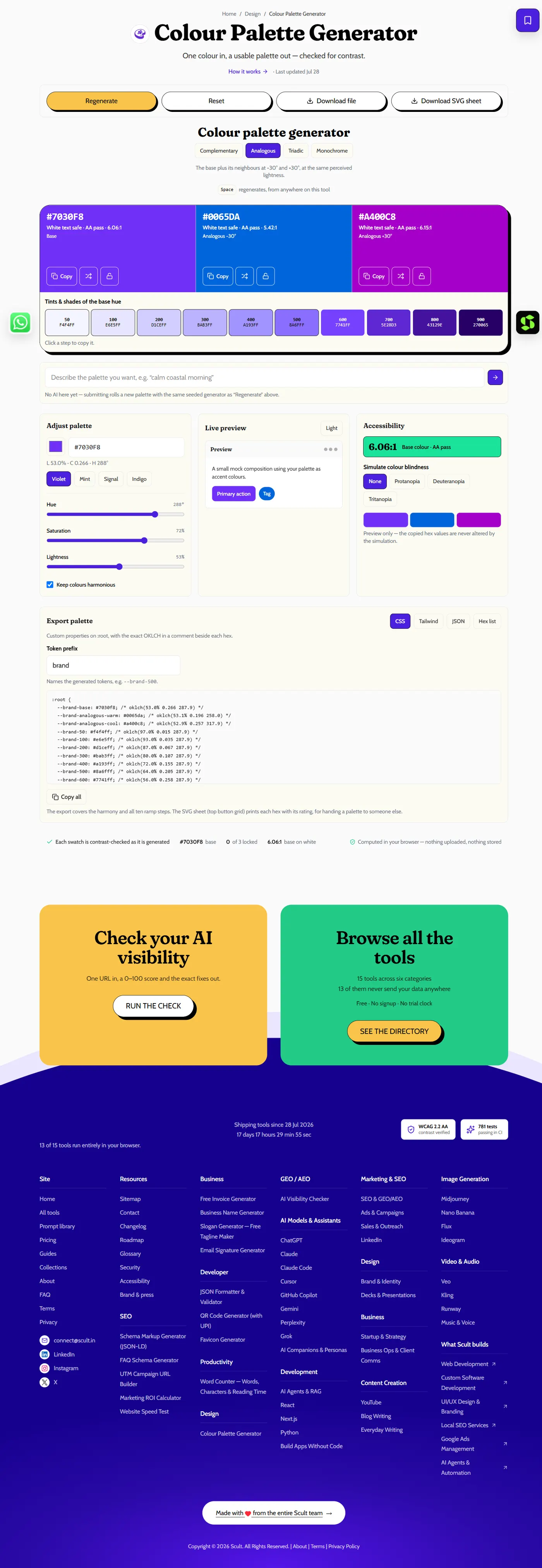
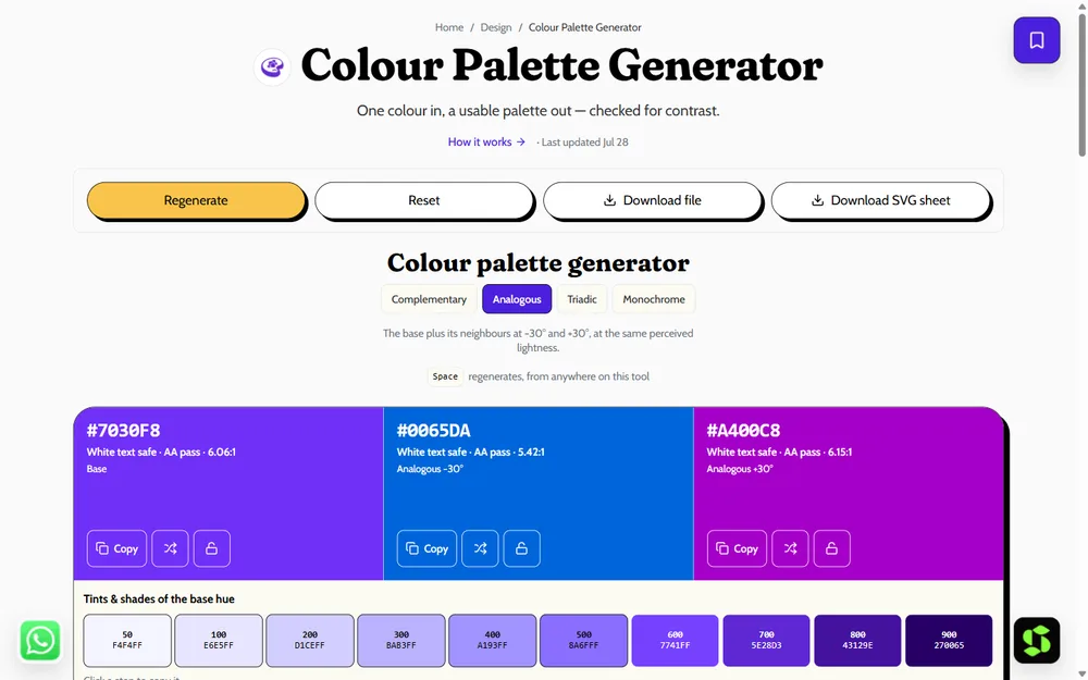
The Colour Palette Generator: pick a base colour and a harmony rule, and get a full palette with WCAG contrast ratios already checked.
Who This Guide Is For
Founders naming and building a brand for the first time, designers briefing a new project, marketers refreshing an existing visual identity, and small business owners handling their own branding without a dedicated designer all draw on the same five-step process, just applied at different scales. A solo founder can work through all five steps in an afternoon using a free generator; a larger organization might spend weeks validating the same choices across multiple stakeholders and a broader set of brand touchpoints — the underlying logic doesn't change.
Why Colour Choice Matters More Than It Seems
A colour palette isn't a decorative afterthought layered on top of a finished brand or website — it's one of the fastest, most immediate signals a visitor processes, often before they've read a single word of copy. Colour choice shapes first impressions of trustworthiness, energy, price positioning, and personality within a fraction of a second, which is exactly why getting it right deliberately, rather than picking "colours that look nice," pays off across every other part of a brand or product.
Step 1: Start With Brand Personality
Colours carry consistent, well-documented associations: blue commonly signals trust and stability, green signals growth and health, black signals premium and sophistication, and warm tones (red, orange, yellow) signal energy and friendliness. Pick a primary colour that genuinely fits how you want customers to feel when they encounter your brand — not simply a colour you personally like, since a mismatch between colour psychology and brand positioning creates a subtle, hard-to-articulate dissonance that visitors pick up on even without consciously analyzing why.
Step 2: Build a Harmony Around Your Primary Colour
Use colour theory to select colours that work together intentionally, rather than picking additional colours at random (see colour theory basics for the full underlying explanation of why these specific combinations work):
- Complementary — colours opposite each other on the colour wheel; high contrast and bold, well suited to strong calls to action.
- Analogous — neighbouring colours on the wheel; harmonious and calm, well suited to a soothing, cohesive brand feel.
- Triadic — three evenly spaced colours; balanced and vibrant, giving you more variety while staying visually coordinated.
- Monochrome — many shades of a single hue; clean, simple, and easy to keep consistent across many different contexts.
Generate any of these instantly from a single base colour with the free palette generator, rather than manually calculating wheel positions and shade variations by hand.
Step 3: Apply the 60-30-10 Rule
Distribute your chosen colours using the 60-30-10 rule: 60% a dominant colour (typically a neutral or your primary brand colour, used for large background areas), 30% a secondary colour (used for supporting elements like section backgrounds or secondary UI), and 10% an accent colour (reserved for buttons, links, and other elements that specifically need to draw attention). This proportional structure gives a design genuine visual balance and a clear focal point, rather than an even, undifferentiated mix of colours competing for attention with no hierarchy.
Step 4: Check Accessibility (Contrast)
Text needs sufficient contrast against its background to remain readable for everyone, including users with low vision — WCAG AA, the common accessibility standard, requires at least a 4.5:1 contrast ratio for normal body text. Our generator flags contrast issues directly as you build your palette, catching a pairing that looks fine to you personally but genuinely fails accessibility standards. See colour contrast and WCAG for the complete breakdown of exactly what these ratios mean and why they matter beyond simple compliance.
Step 5: Test and Export
Preview your chosen palette on real UI elements — buttons, text blocks, navigation — rather than judging isolated colour swatches in the abstract, since colours can read very differently once applied to actual interface elements at real proportions. Keep your final palette to roughly five colours so it stays cohesive and easy to apply consistently; a sprawling palette with too many colours in play tends to look unplanned and undermines the very cohesion a deliberate colour choice is meant to create.
A Worked Example: Building a Palette Start to Finish
To make the five steps concrete, walk through them for a hypothetical productivity app. Step 1: the brand wants to feel focused, trustworthy, and calm rather than flashy — pointing toward a cooler primary colour. Step 2: starting from a muted blue, an analogous harmony pulls in a neighbouring teal for a cohesive, calm supporting colour. Step 3: applying 60-30-10, the muted blue becomes the dominant colour (backgrounds, large UI areas), a light neutral grey becomes the 30% secondary (cards, secondary sections), and a single vivid accent (a warm coral, deliberately a complementary contrast) becomes the 10% used only for primary action buttons. Step 4: every text colour is checked against its background and adjusted until all pairings clear 4.5:1. Step 5: the finished palette is previewed on actual buttons, navigation, and text blocks before being exported as hex codes and handed to the development team. This mirrors exactly how the process should run for a real project, not just a hypothetical one.
Choosing Colours for Different Brand Types
Tech and SaaS brands commonly lean toward blues and cooler tones to signal trust, reliability, and professionalism, often paired with a single vivid accent colour for calls to action.
Wellness and lifestyle brands frequently favor muted, softer tones — sage greens, warm neutrals, gentle pastels — that signal calm and approachability rather than urgency or high energy.
Food and hospitality brands often use warm tones (reds, oranges, warm yellows) specifically because these colours are well-documented to stimulate appetite and convey warmth and friendliness.
Luxury and premium brands tend toward high-contrast, restrained palettes — often black, white, and a single metallic or jewel-tone accent — since restraint itself reads as confidence and sophistication in a way an overly colourful palette doesn't.
How Many Iterations Is Normal Before Finalizing a Palette
It's rare to land on a final palette on the very first attempt, and that's genuinely normal rather than a sign of doing something wrong — most designers cycle through several base colours and harmony options before one clicks with the brand's actual personality and passes accessibility checks cleanly. Budgeting for a handful of iterations upfront, rather than expecting to nail it immediately, keeps the process from feeling stalled or frustrating when the first attempt doesn't feel quite right; treat the first few candidates as genuinely disposable exploration, not a wasted first draft.
Choosing Neutrals: The Overlooked Part of Every Palette
Most of the discussion around palette-building focuses on the primary, secondary, and accent colours, but neutrals — the greys, off-whites, and near-blacks used for text, backgrounds, and borders — do far more of the actual visual work in a typical interface than their limited discussion usually reflects. A pure black-and-white neutral pairing reads as stark and high-contrast; a warmer, slightly cream-toned neutral pairing reads as softer and more approachable, even when the "colour" palette layered on top is otherwise identical. Choosing your neutrals as deliberately as your accent colours — rather than defaulting to generic grey — measurably affects the overall feel of a finished design.
Common Palette Mistakes to Avoid
Choosing colours based on personal preference alone, disconnected from what the brand's personality and audience actually call for. Using too many colours without a clear hierarchy, producing a visually noisy result that undermines the polish a deliberate palette is meant to provide. Ignoring contrast until late in the design process, discovering accessibility failures only after a design is otherwise finished, rather than checking as you build. Chasing trends without a stable base — a palette built entirely around a current trend risks looking dated as soon as that trend passes; see colour palette trends for 2026 for how to use a trend as an accent rather than the whole foundation.
Getting Feedback on a Palette Without Bias
When soliciting feedback on a candidate palette, how you ask the question shapes how useful the answer is. Asking "do you like this?" invites a purely aesthetic, often unhelpfully vague reaction. Asking "does this feel trustworthy and modern?" (referencing the specific personality traits from Step 1) gets a far more useful, targeted answer, since it directs the reviewer's attention to whether the palette actually achieves its intended goal rather than simply whether they find it visually pleasing in the abstract.
Testing a Palette Before Committing
Before finalizing any palette, test it against a few real scenarios rather than judging isolated swatches: mock up your actual homepage or a key screen using the real colours, view it in both bright and dim lighting conditions if possible, and get a reaction from at least one person outside the decision process, since unfamiliarity with a design's history often surfaces an honest first impression more clearly than continued exposure does for the person who chose the colours. A palette that looks good as a small swatch grid can behave very differently once applied across full-size UI elements, so this step is worth the extra time before printing materials or shipping a live design.
Colour Palettes for Physical vs Digital-Only Brands
If your brand extends into physical materials — packaging, signage, printed collateral — beyond a purely digital presence, factor print reproduction into your palette decisions from the start, not as an afterthought. A hex code chosen purely on-screen doesn't always reproduce identically in CMYK print, and a colour that looks vivid and saturated on a backlit screen can look noticeably duller once printed on matte packaging stock. Test-printing your finalized palette on the actual materials you'll use, before committing to a large production run, catches this mismatch while it's still cheap to adjust.
Palette Considerations for Multi-Product or Multi-Brand Companies
If you're building a palette for a company with multiple distinct products or sub-brands, decide deliberately upfront whether each one gets its own distinct palette or shares a common core with product-specific accents layered on top. A shared core with distinct accents preserves overall brand recognition across the portfolio while still letting each product feel appropriately distinct; entirely separate palettes per product can work but risk diluting the parent brand's overall visual coherence if not managed carefully with a clear, deliberate system behind the variation.
Applying Your Palette Consistently
Once finalized, a palette only delivers real value if it's actually applied consistently everywhere your brand appears — your website, your marketing materials, your social presence, and any physical materials like packaging or signage. Document your exact hex codes and their intended use (which colour is your 60%, your 30%, your 10% accent) so anyone working on your brand later — a new designer, a marketing hire, an agency — can apply it correctly without having to guess or reverse-engineer your original choices from existing materials.
Palette Choices and Competitive Differentiation
Before finalizing a palette, it's worth briefly checking what colours your closest direct competitors already use — not to avoid every overlap entirely, since some categories genuinely converge on similar colour conventions for good reason, but to avoid an accidental near-identical match that could confuse customers comparing options or make your brand feel like a copy rather than a genuine alternative. A quick competitive scan takes minutes and can save a much more painful, expensive rebrand later if a near-identical palette causes real confusion in the market once both brands are actively competing for the same customers' attention.
Choosing Colours for Dark Mode From the Start
If your product will support dark mode, design your palette with both light and dark contexts in mind from the beginning rather than retrofitting a dark theme after the light version is finished. Colours that work well on a light background often need adjustment — usually a shift in saturation or value — to read correctly against a dark background, and accent colours in particular frequently need to be brightened or slightly desaturated for dark mode to avoid looking muddy or insufficiently vivid against a near-black backdrop. Building both modes together from the start, using a generator that can preview both, produces a more coherent result than treating dark mode as an afterthought layered on at the end.
When to Bring in a Professional Designer
The five-step process in this guide gets most small businesses and solo founders to a genuinely solid, workable palette without any professional design help. It's worth bringing in a professional specifically when the stakes are meaningfully higher — a significant rebrand for an established company with real existing brand equity at risk, a complex multi-product portfolio needing a coordinated system across many touchpoints, or simply when internal stakeholders can't reach agreement and need an experienced outside perspective to break a deadlock. For a straightforward small business or early-stage startup, working through the process yourself with a free generator is usually entirely sufficient.
Palette Documentation: What to Hand Off to a Team
A finished palette should be documented clearly enough that anyone joining the project later can apply it correctly without guessing. At minimum, document: each colour's hex code, its intended role (dominant, secondary, accent, or a specific neutral), any approved variations (a lighter tint for hover states, a darker shade for active states), and the specific contrast pairings that have been verified as accessible. This documentation — whether a simple shared document or a proper design system file — is what actually makes a palette usable at scale across a team, rather than existing only in the original designer's head or a single unlabeled export file.
How This Connects to Your Broader Brand Identity
Your colour palette is one piece of a larger identity system that also includes your logo, typography, and overall visual tone — all of which should reinforce the same brand personality you started with in Step 1. See logo and brand identity design for how colour choice fits alongside these other foundational identity decisions, and what makes a good brand name if you're building your identity from the ground up rather than refining an existing one.
A Simple Palette Checklist Before You Ship
Before finalizing and rolling out any palette, run through a short final checklist: does the primary colour genuinely reflect the brand personality from Step 1, does the harmony feel intentional rather than accidental, does the 60-30-10 proportion give the design a clear focal point, does every text pairing pass WCAG AA contrast, has it been previewed on real UI rather than isolated swatches, and is it documented clearly enough for someone else to apply correctly without guessing. Answering yes to all six is a reliable signal the palette is genuinely ready, rather than just looking finished at a glance.
Revisiting a Palette Over Time
A finished palette isn't necessarily permanent — as a brand matures, expands into new products, or simply grows tired of a look that's stayed static for years, revisiting the palette deliberately (following the same five steps, informed by what's actually worked and what hasn't) is a reasonable, healthy part of a brand's evolution. The distinction worth holding onto is between a deliberate, considered refresh grounded in genuine business or brand reasons, and a reactive change driven purely by boredom with the current look or an unconsidered urge to chase whatever's currently trending — see colour palette trends for 2026 for how to weigh current trends against long-term brand stability specifically.
Build and Export Your Palette
Rather than manually calculating harmonies, contrast ratios, and hex codes by hand, the free colour palette generator builds a complete, contrast-checked palette from a single base colour in seconds, with ready-to-use hex codes and CSS you can drop directly into a project.
Frequently Asked Questions
Is a five-colour palette a strict rule I always need to follow exactly?
No — five is a reliable, cohesive default for most brands, but it's a guideline rather than a strict rule; some genuinely complex products reasonably need a few more, while some minimalist brands work well with even fewer.
Does the size of my business change how much effort this process deserves?
Not the process itself, just the scale of validation — a solo founder can move through all five steps quickly and confidently, while a larger organization may want broader stakeholder testing and documentation at each step, given how many more people and touchpoints the finished palette will need to serve consistently.
Can I choose a palette before I've settled on a business name or logo?
It's possible, but most brands get stronger results settling the name and at least a rough sense of the logo direction first, since colour is meant to reinforce the same personality those other decisions establish — see how to come up with a business name if you're starting from scratch.
What's the single most common reason a palette fails to feel cohesive?
Skipping the harmony step and picking each colour independently based on individual preference, rather than deriving the whole set deliberately from one base colour using a proven colour-theory relationship — cohesion comes from that shared underlying logic, not from each colour simply looking fine on its own.
How long does the whole palette-choosing process typically take?
For a solo founder or small business, a focused session of one to a few hours using the five steps and a free generator is usually enough to reach a solid first version, with a few additional iterations over the following days as you test it against real feedback.
Can I reuse the same palette across a website, app, and printed materials?
Yes, and you generally should for consistency — just verify the palette holds up in each specific medium, since screen colours (RGB) and print colours (CMYK) don't always reproduce identically, and a test print is worth doing before a large physical production run.
Is there a final checklist to confirm a palette is genuinely ready to ship?
Yes — confirm it reflects your intended brand personality, the harmony feels intentional, the 60-30-10 proportion gives a clear focal point, every text pairing passes WCAG AA contrast, it's been previewed on real UI, and it's documented clearly enough for someone else to apply correctly.
When should I hire a professional designer instead of doing this myself?
Mainly for higher-stakes situations — a significant rebrand with real existing brand equity at risk, a complex multi-product system, or an internal stakeholder deadlock needing an outside perspective. For most small businesses and early-stage startups, this five-step process with a free generator is entirely sufficient on its own.
Should I check what colours my competitors already use before finalizing mine?
Yes, briefly — not to avoid every overlap, since some categories converge on similar conventions for good reason, but to avoid an accidental near-identical match that could confuse customers or make your brand feel derivative rather than distinct.
How many colours should a palette have?
Around five — a primary colour, a secondary colour, an accent colour, and two neutrals (a dark and a light) for text and backgrounds — is a reliable, cohesive default for most brands and websites.
What is the 60-30-10 rule?
A proportional guideline for applying colour: 60% a dominant colour, 30% a secondary colour, and 10% an accent colour, giving a design balance and a clear visual focal point rather than an even, undifferentiated mix.
How do I pick brand colours?
Start with the personality and feeling you want your brand to convey, choose a primary colour that fits it, build a harmony around that primary using colour theory, then check contrast for accessibility before finalizing.
Should I choose colours before or after my logo?
Either order can work, but many brands develop them together, since colour and logo form are both expressions of the same underlying brand personality — see logo and brand identity design for how the two decisions typically inform each other.
Can I use a free tool to build a full palette from one colour?
Yes — the free palette generator builds a complete, contrast-checked palette from a single base colour, applying colour theory automatically and flagging any accessibility issues.
How do I know if my colour palette passes accessibility standards?
Check every text-and-background pairing against WCAG contrast ratios — at least 4.5:1 for normal text under the AA standard — using a contrast checker like the one built into our palette generator. See colour contrast and WCAG for the complete requirements.
Is it okay to follow a current colour trend for my brand?
Yes, as an accent layered onto a stable, timeless base — but building your entire palette around a passing trend risks looking dated once that trend fades. See colour palette trends for 2026 for the current directions and how to adapt them safely.
What's the biggest mistake people make when choosing a palette?
Picking colours based purely on personal taste, disconnected from the brand's actual personality and audience, and skipping accessibility contrast checks until the design is otherwise finished rather than checking as they go.
Turn a palette into a full brand system. Scult does UI/UX & branding.